![]()
Where should we start? Let me say that “WhatAreYouBuyen” had no intentions of ever being a dedicated airsoft channel, I just really liked Resident Evil 4 and I thought it would be a funny name for a review channel. Anyways after the airsoft reviews took off, 25,000 views in two weeks, that was crazy to me back then!

This was back when youtube allowed custom icons for partners beneath their videos.

And who could forget the old youtube layout? Remember the old days when channels had backgrounds? Banners were clickable? Those were really fun times!
At this point WhatAreYouBuyen probably had 400 subscribers and 200,000 total views. Which was a crazy ratio of views : subs. I didn’t realize it, but it meant my videos were getting high search engine traffic. No one knows the search engines perfectly, not me, not back then and still not now. But I did something right! 🙂
Let’s fast forward 4000 subscribers later!
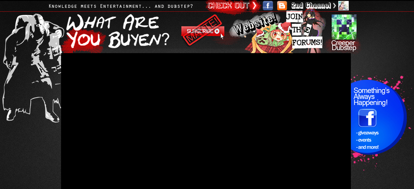
These were good times! The channel design was looking pretty decent! Anyone who visited our channel knew we were a high quality partner with high quality entertainment and tons of fun on our facebook and forums!
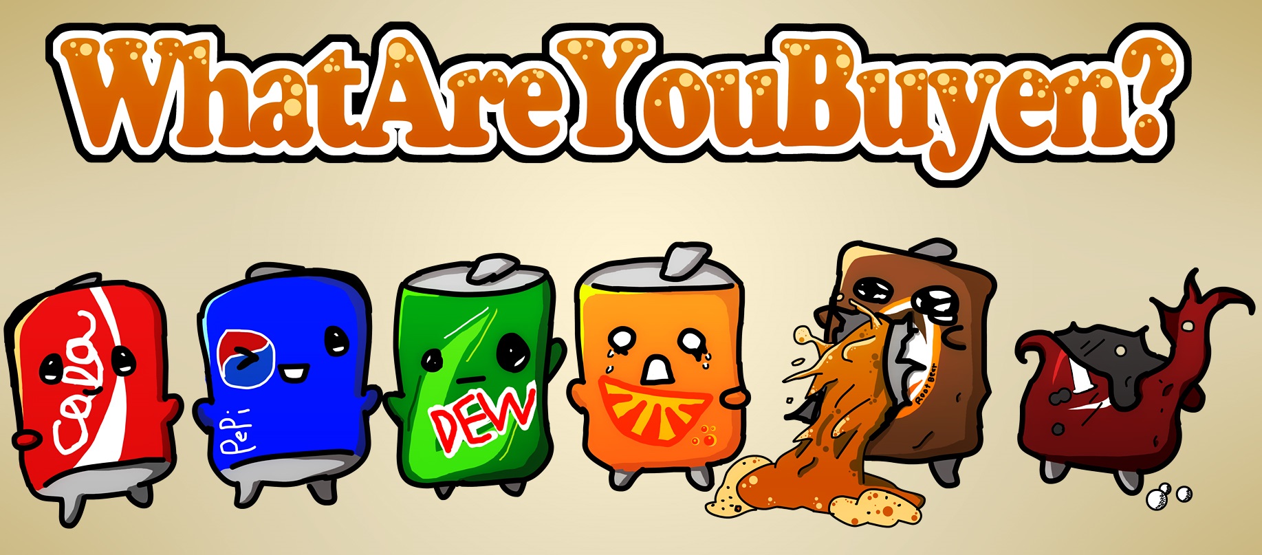
We thought we were the biggest people in airsoft! (I mean seriously? Who makes better videos than us???) So you know what that meant, T-shirt designs!
![]()
Some clever ideas, some terrible ideas. Our T-shirts didn’t sell too well, not like we even made much money off the sales. (Would have been better to bulk order shirts)
But this marked the beginning of our banding adventure. And of course, WhatAreYouBuyen is pretty well known on angry airsoft forums, as well as our local field where literally EVERYONE I try to hand a business card, “Dude! I love your videos!! We’re already subscribed!” – Now hearing that is just awesome!
10,000+ subscribers later: The time had come, we knew we needed to really work on our website! We had a lot of things to say, and not enough video making to say it all. The website was born and out of it, we needed real, modern looking logos. How do you make a logo for something called “WhatAreYouBuyen?” How is that illustrated in a way that isn’t RE4 related??
This tux, which is also a “W” represents “WhatAreYouBuyen” from a professional business man’s perspective. But of course this isn’t really who we are or what we do. (yet)
It was a tough decision, we had our original thumbmail and logo FOREVER! (The first image at the top)
![]()
So after playing Bioshock Infinite, I finally got the inspiration and idea to create a logo that
1. Looks awesome!
2. Reminds me of a Bottle Cap. (We shoot soda cans in almost every review if you haven’t noticed…)
3. Looks clean, professional and can be sized pretty small and still recognizable.
This may or may not be our final logo design. But for the time being. 15,000+ subscribers and a relatively small website. This logo is appropriate.
![]()
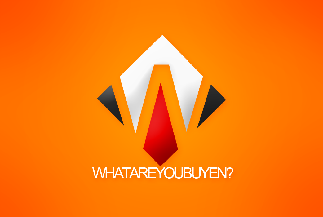
And of course this logo exists because the website called for a rectangular logo.
The blue diamond thing in the “Y” represents the blue fire that you see when you encounter the merchant in RE4, see? We’re still referencing our roots discreetly.
It’s been a long journey! Who knows what lays ahead, but I have to thank the fans who helped make everything possible! Thank you! 🙂
352 Comments